How to Build and Design Your Fundraising Page
In this article, we will show you how to use the Fundraiser Builder to design your fundraising page.
The Fundraiser Builder gives you full creative control over your page design. This guide covers how to add sections, customize layouts, format text, and apply colors to engage your supporters.
Adding Sections
Sections are the core building blocks of your fundraiser homepage.
-
To add a section: Click the Blue Plus (+) button located between any two sections.
-
To manage sections: Sections can be rearranged, duplicated, or customized to fit your needs.


Recommended Sections
- Driver Previews: Depending on your fundraiser type, use these to let donors participate directly. Options include Donation Preview, Auction Preview, Raffle Preview, Rules of Play, and Live Auction Preview.
- Sponsor Section: A dedicated space to display logos and acknowledge your event sponsors and partners. It provides a platform to highlight the contributions and support from various sponsors, fostering a sense of partnership and recognition.
- Impact Section: Highlight the tangible outcomes of your initiative (e.g., specific achievements or statistics) to show donors the value of their contribution.
- Feature Section: A versatile space to spotlight key highlights, specific features, or unique attributes of your event.
- Fundraiser Activity: A dynamic feed displaying real-time fundraising progress, donor contributions, and goal tracking to build momentum. This section is crucial for engaging supporters and encouraging continued participation.
- Custom Section: A flexible canvas for unique content. Use this to add text, images, and videos that don't fit into predefined categories.
Customizing the Sections
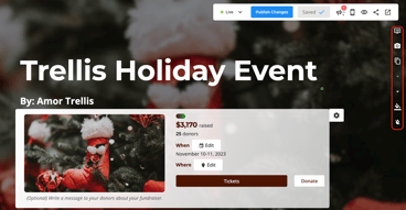
You can adjust the look of your sections using the toolbar on the side of each block.
The Event/Header Section
-
Layout: Change the visual layout or background image.
-
The background image is intentionally blurred to ensure that the information on your event card is easy to read.
- If you prefer a solid background colour, you can create an image with the desired colour and upload it as the background.
- We do not recommend duplicating your event/header section.
-
-
Gradient: Add or remove a color gradient overlay.

All Other Sections
-
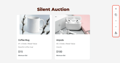
Delete/Duplicate: Remove unwanted sections or copy existing ones.
-
Move: Use the arrows to move sections up or down the page.
-
Background: Change the background color to match your branding.

Text Formatting
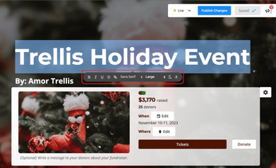
To format text, highlight the desired text to reveal the formatting menu.
-
Style: Adjust font size, color, headings, and bullet points.
-
Links: Use the Chain Icon to create hyperlinks.

Design Settings
To access global settings, open your Sidebar Settings and navigate to Fundraiser Settings.
Page Design (Colors)
-
Primary Colour: Updates buttons and heading text.
-
Secondary Colour: Used for the fundraising thermometer and highlights.
Header Design
Under Header Design, you can customize the navigation bar at the top of your page:
-
Show/Hide header tabs.
-
Edit the text for Call-to-Action Buttons.
-
Edit the text for Links in Header.

Important Notes & Pro Tips
-
Video Support: We currently support YouTube videos only. Shorts, Instagram videos, or other platforms are not supported.
-
Image Sizing: View our guide on Recommended Photo Sizes to Use on Trellis.
Need Help?
Did this answer your question? If not, please reach out to our Product Engagement Team via the blue chat icon or email support@trellis.org.